Announcement

Collapse
No announcement yet.

can't decide....

Collapse
X
 
  • Filter
  • Time
  • Show
Clear All
new posts

    can't decide....

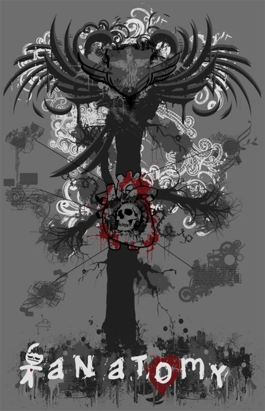
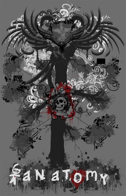
    Trying to figure out how to finish this before i submit it to the guy i'm designing it for. Just wondering what version you guys like best or if you can suggest any modifications. thanks. it's for a t shirt. I know they seem like slight changes but I really can't decide, I've been staring at this trying to finish it all day.

    HI RES:
    http://sixslow.deviantart.com/art/De...rout-140737042


    Last edited by jboyce; 10-18-2009, 08:17 PM.

    #2
    I'd prefer the second. It was the only one in which I could immediately spot the skull in the heart.

    Comment


      #3
      with or without the objects behind the outer lying text?

      Comment


        #4
        cant decide either . . .

        its between the first and second one for me. . . let me think about a little more and i'll get back to ya.

        The Hatch < < - - - - - - - - - - - - - - My Cars - - - - - - - - - - - - - - - > > The Accord

        Comment


          #5
          2nd for sure. to much red in the 1st.

          BB6 2001 Prelude SH

          Originally posted by Makaveli2k
          Don't be a sissy. Pull out, spit on the tip like they do in the porno's and get back in there.

          =p

          Comment


            #6
            The second one.

            Those black embellishments pull your eyes around the entire piece, although they also make it quite busy. If you could find a middle ground between the two, by lowering the amount of black or replacing it with the gray used on the tree trunk.

            I also HIGHLY suggest enhancing your contrast around the "anatomy" title to give it greater readability. Maybe by adding black, similarly to how you did on image #2; or adding a black stroke / outer glow / drop shadow around the text and character.
            My pictures/photos will return soon...

            Comment


              #7
              Originally posted by Joshy View Post
              The second one.

              Those black embellishments pull your eyes around the entire piece, although they also make it quite busy. If you could find a middle ground between the two, by lowering the amount of black or replacing it with the gray used on the tree trunk.

              I also HIGHLY suggest enhancing your contrast around the "anatomy" title to give it greater readability. Maybe by adding black, similarly to how you did on image #2; or adding a black stroke / outer glow / drop shadow around the text and character.

              Ya now that you say that i notice the black is pretty distracting i'll try and fix that. thanks for the advice. i'll try and fix the text too. it looks different in hi res though. this is about 10% of actual size....its 20x25 inches.

              Comment


                #8
                second one
                ~Nick~
                FSAE (F Series Accord Enthusiasts) ..."A dying breed thats taking it to the next level" Lucky #13
                MR Thread:http://www.cb7tuner.com/vbb/showthre...ight=Grumpys93

                Comment

                Working...
                X