

i love the theme, but i'm not feeling the lower font. maybe chop a different font?
-
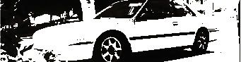
-
if there is anyway you can get the lower font the same as the top, that would be cool.Comment
-
Originally posted by sublime
ask and you shall recieve!
later
JoshCB7 Tuner Decal MAN
CB7 Decal Store[URL=http://www.cb7tuner.com/vbb/forumdisplay.php?f=104]http://www.cb7tuner.com
http://jc-graphix.com/index.phpComment
-
looks good but to me that 7 is kinda wack..... ill see if i can come up with something on illustrator....Comment
-
all is good, its just teh 7........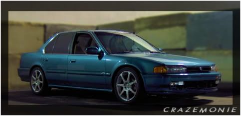
thanks to phempa for teh sig!
Comment
-
-
I like the look.... it stands out ok.... Why not put a mantis in there somewhere... 

Comment
-
wow
Damn, I could feel the heat from that one.... \Originally posted by yeamans17 It just looks like somethings not there. What is something you can look at thats just makes you think mid-west.... Maybe a tornado or something..... A shirt with letters is just a shirt with letters.... A shirt with letters and a reasonable monument for our own lil band of brothers is a masterpiece
Comment
-
Put the states in the background..?Comment
-
That may not be a bad idea.Originally posted by whitejmComment
-
How about something like these?Originally posted by whitejm
Was browsing around the web. Found these. None of which had any copyright info. What does anyone think?
Midwest region

With CB7 added

Midwest Sketch

EDIT: Just noticed that the top 2 dont include the Dakota's or Minnesota but the bottom one does? Any thoughts? LaterLast edited by MadSpleen85; 11-08-2006, 10:12 PM.Comment
-
Not proud to be an American Zach? LOL. J/P. I like the second one down. I think it would look a little better if someone threw the CB7tuner.com logo on there instead of just the CB7 that I added in Paint. LOL. Or the second one down as the back of the shirt and the third one down as the background for the front of the shirt (with the dakota's and minnesota removed) with the original design over the top but still so you can see the outline of the states in the background? Did that make any sense? I said it before and I will say it again, Dont drink and Type. Anyone else have anythoughts on the design? LaterComment
-

Comment
-
i'de say to not have so much stuff in the backround, keep it basic. dont want to have a headache each time i look at it.Comment
-
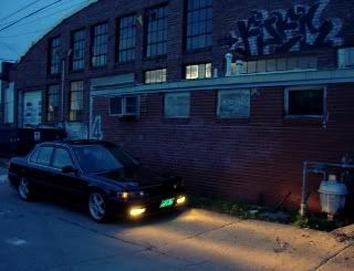
how about a sillouette of a cb in the background with cb7tuner midwest in the middle or to the bottom of the sillouette? keep it simple and real. let me try to make something and chime back.
 <
<

(129)Transactions and counting Comment



Comment